 A deeply engaging collection of stories that draw on an powerful source in unexpected and striking ways. Biblical creatures and concepts are so much part of the history and imagination of the Western world that it is very difficult to think of them in a fresh way. Until someone does. Frank Martin has the confidence and craft to take on the challenge of giving new, vibrant life to longstanding icons. The approach is simple, elegant and happily unexpected, Frank Martin takes the creatures and ideas at face value and gives them a new context to show their undiminished power. Never metaphors, but entities in their own right they emerge as sharp , striking characters fully in charge of their own stories. The following are some of the stories contained within this great collection, all of the stories deserve and reward the reader's time and attention.
"The Great Hunt" Igor Chakal (Art), Stanislaus Leonov (Colours). A couple arrive on game reserve looking to hunt a creature that apparently has killed other hunters. Naturally they ignore the warnings from the warden and head out on their way to capture their prey. It does not end well. Frank Martin includes some details to give the considerably more weight and impact. The reason the couple are hunting the creature is simple and strong and the final pay off effective.The set up seems to deliver stock characters in a well worn situation, the motivation for the trip pulls them directly to life just in time to encounter the Behemoth.
Igor Chakal's art captures the feel of old films about reckless white big game hunters who were lead by arrogance out of their depth in the bush. This is exactly what the straight lines of the story needs, the momentum that leads to the confrontation. When it arrives it is delivered with great force and impact. The details are every bit as bloody and brutal as they need to be. Stanislaus Leonov's colours are a bright and bold as the reserve should be, when the switch comes to night time, the lighting is not dimmed to hide the action. Stanislaus Leonov manages something difficult, the nighttime is important, still the details of the attack have to be vivid and the sequence works without feeling absurd on either count.
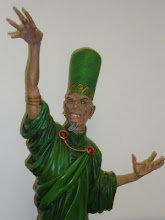
"Down with the Sickness" Joaquin Gr,(Art) Matej Stasko (Colours), Kel Nuttall (Letters). A dying man uses his pharmaceutical company as his personal resources when he becomes terminally ill. When he meets the source of his illness his problems become more clearly defined. Embodying an idea is always a tricky proposition, how to balance the requirements of both aspects. Frank Martin makes it look easy as Pestilence jumps from the comic with vivid, baleful life and sharp personality. A nasty sense of humour and a brutally frank approx to his work, make him fascinating. Joaquin Gr, manages the equally difficult task of making Pestilence human enough to be easily read and foreign enough to be powerful and threatening. Looking like a green almost corpse possessed of enormous energy is a brilliant way to solve the problem. the details of the context give the story a very strong physical anchor that allows the ideas to operate successfully. Matej Stasko's colours capture the two elements of the story, the mundane story of a rich man's fear of death and the resources he uses to fight it and the triumphant march of his unstoppable enemy. The colours give lift and strength to both aspect of the story.
Kel Nuttals letters are consistently subtle, easy to read and change to support the story with care and focus. The sound effects are a joy, they give the emphasis just where it is needed. The ideas never push out the stories and the stories never overwhelm the ideas, a extraordinary balance of precision and force by very talented creators who have delivered a great comic.
"At Death's Door" Anthony Pugh (Art), Julian Dominguez (Colours), Ken Nuttall (Letters) is the stand out story in this collection, sharp, blackly funny and with a brilliant set up and stunning pay off, it is a serious pleasure. Death is despondent and Cain has been sent to check on him and get him back on track. Frank Martin has taken a wonderfully imaginative and unexpected angle that nicely plays with reader expectations. Anthony Pugh's friendly art sells the story idea with understated confidence, using a very familiar setting to capture and control readers expectations with subtle skill and a wonderfully expressive cast. Julian Dominguez uses the colours to anchor the action with care, amplifying the emotional tones of the story and bring out every nuance the writing and art.Ken Nuttals letters are natural and unassuming , the sound effects are perfect they give the force required when required.
"The Abandoned" Francesco Conte (Art) , Macerena Cortes (Colours), Kel Nuttall (Letters). An argument between a son and his mother gains heat and volume as the absent father is included in the mix. What is really impressive about this story is the way the argument feels old, it has been had many times before, it is also fresh each time, the emotions are never less than raw. The development of the argument strongly suggests one conclusion before a wonderfully convincing one is given instead. It is sign of the strength of the writing that the weight of the story can be so convincingly turned in a tiny space without cheating the reader or unraveling the story. Francesco Conte has a considerable task to accomplish with the art, the context is very confined and there are just two members in the cast, the action is emotional rather than physical. The tension is developed fully as the cast respond to the changing dynamics of the argument and the balance of forces shift. The impact of rage is caught with subtlety and force as is the abrupt shift as the fight alters its tone. Macerena Cortes' colours give definition and depth to the context and the cast, they capture the shifting intensity of the emotions as they spill and roar. They are slightly muted which allows the real force of the words to come out loud and clear.
And finally, "God Complex." Martin Szymanski (Art), Miguel Marques (Colours), Ken Nuttall (Letters). A scientist issues invitations to a conference without revealing the topic, he has enough of a reputation to bring a crowd, he makes a breathtaking announcement and finds that an unexpected attendee has a problem with that. A claim to know everything could annoy someone who does in fact know everything. In a wonderfully bold and unexpected story God is not amused and it does not end well. Martin Szymanski solves a really difficult problem , what does God look like? Martin Szymanski makes an entirely logical choice within the context of the story that confidently strikes out away from the most familiar versions. Cosmic action is delivered with the same attention to detail as a conversation, the move from one to another is entirely natural and controlled. The clever shifts of the story are captured and framed perfectly. Miguel Marques bring bright colours to the story managing to capture the emotional tones and context of the story with pin point accuracy,even at its harshest God's actions will always be full of light. Ken Nuttall's letters make a story with a lot of text light and easy to read.
Frank Martin and the talented team of creators have proved again that there are simply no rules for talent, which is always a deep pleasure to find out again at first hand. What a great comic.
Chief Wizard Note: This is a review copy very kindly sent by Frank Martin. He is running a Kickstarter for the book, give yourself the unbounded pleasure of that only a great comic can deliver and get a copy for yourself.
No comments:
Post a Comment