 A great fun all ages horror comic that makes a very difficult task look easy. Any all ages comic has to solve a difficult problem, if it leans too heavily to one section of the audience it will loose the others, House of Fear is a great example of how to cater to the widest possible audience with confident delivery and a smart story. Ben Grumpledowns, a young boy gets a surprise when he gets a delivery after sending off to a ad in an old comic. Naturally this is not a good thing. A neatly set up situation releases the problem and within the context of the school Halloween Carnival the problems arise in a very engaging way.
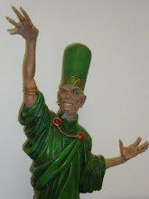
Brandon Barrows' idea of a delivery from a long defunct company listed in the back of an old comic is just catnip to any comic collector who has read these extraordinary adverts with joy and amazement, it gives the perfect lead in with the young cast. The choice of monster is equally wonderful, Shoggoths have the shadow from H.P. Lovecraft on them and are scaled in the story to be threatening without being repulsive.The cast are engaging and energetic, the are not too cute or sawn-off adults, they emerge as children bound on enjoying their lives as much as they can and they give the reader the same chance to enjoy it too.
Rafael Loureiro' interior art is friendly and full of details that create a believable and solid context. The cast are clearly individual and each is strongly expressive without every being cartoony. The action is fast and exciting. James Hislope delivers the bookends that capture the spirit of the earlier horror comics without breaking the tone or intent of the main story.
Jodh Jensen colours are great, they bring out the detail of the art and create the emotional tone of the story, when the trouble is revealed it is dark and never overwhelming, the colouring brings the excitement without the possible fear and terror.
Matt Krotzer lettering is quiet and natural, the special effects are as loud and dramatic as required, they give the action a nice extra list that it needs to push the story. Hugely enjoyable.
No comments:
Post a Comment