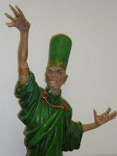
 Very engaging and enjoyable collection of stories that are substantial, thoughtful and unexpected. Frank Martin uses unusual source material and rises to the implicit challenge, taking big story risks that pay off handsomely.The dynamic cover is by Jonathan Rector.
Shoulder Djinn. Frank Martin (Writer), Lucas Urruita (Art), Ezequiel Dominguez (Colours), Kel Nuttall (Letters). A young man has plans for the day in front of him, so do the two competing djinns who are giving him advice. Two voices giving contrary advice about what to do. It appears that one is stronger than the other, one strong one weak. A internal struggle is made external and very physical, then the real issue is neatly pulled up to the fore, giving the story a different slant.
Lucas Urruita's art is a pleasure to read, the cast are vivid and expressive, the action is tremendously forceful. Indecision and doubt are hard to successfully express, it can just look bemused, Tommy moves through the various stages to his final decision with clarity. The shifting perspectives of the story are delivered with care and attention to detail. Ezequiel Dominguez's colours are crucial to the story, they guide the reader through the different perspectives with ease, they give the djinns strong physical presence and weight, which is vitally important as the action develops.
The Abandoned. Frank Martin (Writer), Francesco Conte (Art) , Macerena Cortes (Colours), Kel Nuttall (Letters). An argument between a son and his mother gains heat and volume as the absent father is included in the mix. What is really impressive about this story is the way the argument feels old, it has been had many times before, it is also fresh each time, the emotions are never less than raw. The development of the argument strongly suggests one conclusion before a wonderfully convincing one is given instead. It is sign of the strength of the writing that the weight of the story can be so convincingly turned in a tiny space without cheating the reader or unraveling the story. Francesco Conte has a considerable task to accomplish with the art, the context is very confined and there are just two members in the cast, the action is emotional rather than physical. The tension is developed fully as the cast respond to the changing dynamics of the argument and the balance of forces shift. The impact of rage is caught with subtlety and force as is the abrupt shift as the fight alters its tone. Macerena Cortes' colours give definition and depth to the context and the cast, they capture the shifting intensity of the emotions as they spill and roar. They are slightly muted which allows the real force of the words to come out loud and clear.
Down with the Sickness. Frank Martin (Writer), Joaquin Gr,(Art) Matej Stasko (Colours), Kel Nuttall (Letters). A dying man uses his pharmaceutical company as his personal resources when he becomes terminally ill. When he meets the source of his illness his problems become more clearly defined. Embodying an idea is always a tricky proposition, how to balance the requirements of both aspects. Frank Martin makes it look easy as Pestilence jumps from the comic with vivid, baleful life and sharp personality. A nasty sense of humour and a brutally frank approx to his work, make him fascinating. Joaquin Gr, manages the equally difficult task of making Pestilence human enough to be easily read and foreign enough to be powerful and threatening. Looking like a green almost corpse possessed of enormous energy is a brilliant way to solve the problem. the details of the context give the story a very strong physical anchor that allows the ideas to operate successfully. Matej Stasko's colours capture the two elements of the story, the mundane story of a rich man's fear of death and the resources he uses to fight it and the triumphant march of his unstoppable enemy. The colours give lift and strength to both aspect of the story.
Kel Nuttals letters are consistently subtle, easy to read and change to support the story with care and focus. The sound effects are a joy, they give the emphasis just where it is needed. The ideas never push out the stories and the stories never overwhelm the ideas, a extraordinary balance of precision and force by very talented creators who have delivered a great comic.
Chief Wizard Note: This is a review copy very kindly sent by Frank Martin, If you want to purchase a copy of Modern Testament Vol 3., and you should as really good comics will endow you with cosmic powers of joy in living, it will be available mid-December from insanecomics.com .


No comments:
Post a Comment